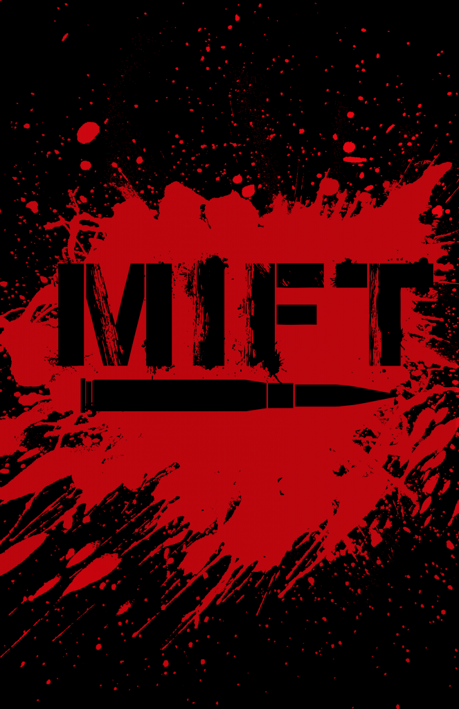
One of the first things that I did when I decided to relaunch the MIFT comic book series was work on the title image. Since I knew that I wanted to have a more mature and bloody comic, I decided fairly quickly that there would be blood splatter around the title. And since he was still going to be using a lot of guns, I also decided early on in the process that there would be a bullet. And that’s how the title image for MIFT became the image below.
There is also the light variation of the title image which replaces all of the black elements with white. That version can be seen below.
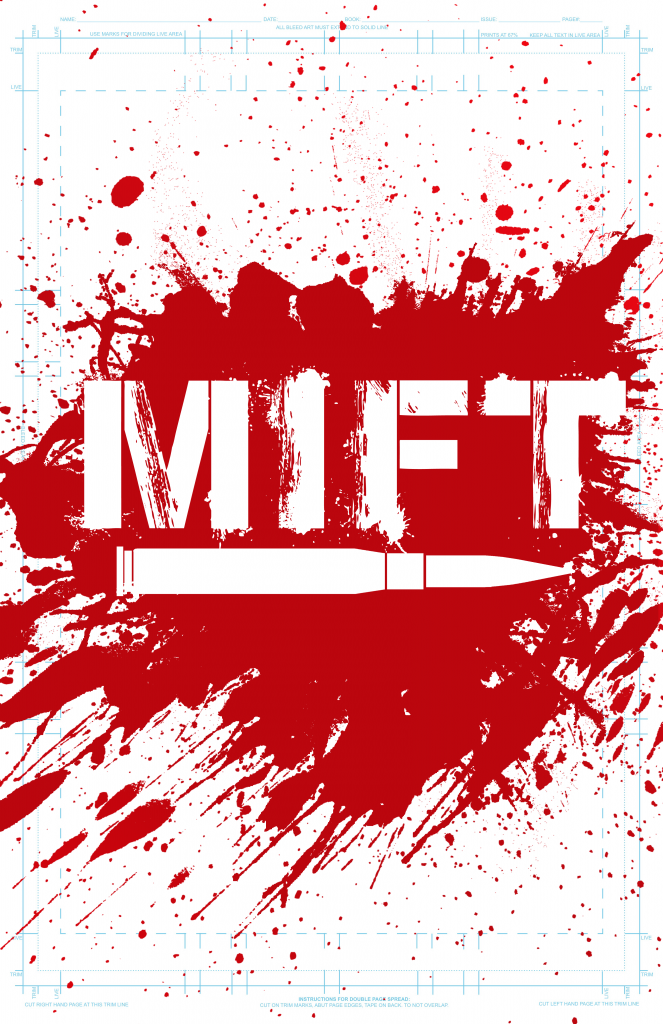
Because red is a color that looks good on both black and white, there was nothing to change from both versions of the title image. Once I had the title image, I also realized how much easier it is to start promoting the comic and that I could at least show something to people as opposed to just talking about this idea in my head.
I also flirted with the idea of adding a red Canadian Maple Leaf to the bullet but ultimately decided against it because I didn’t think it was necessary to plaster a Canadian symbol in order to let everyone know that the protagonist was Canadian.